Race-Technology Video4 – Finally a Useful Layout!
Finally, wasn’t easy but came up with an awesome layout for our Video4 data-logger. I did a short write-up on this since I’m sure I’m not the only one that was confused first time I opened this software up!
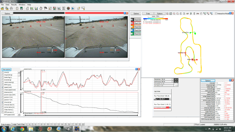
Ok, so what we’ve got here is the “quick graph”, “track map”, “sector/lap time”, and “values table”. What unlocked the awesomeness of this was the quick graph, which after much research will actually sync of runs at a “start” marker like RaceKeeper does…
Anyways, so process goes like this.
- Load in the new layout
- Pick your data files of choice
- Once you’ve got the runs loaded, click on “Large Track Map” on the bottom tab (you can use the smaller one on the front tab too if you want).
- On the map, click “Data”, check “Multiple Plots”, and then check the runs you want and select the run from the drop-down menu. Click the upper left X to close out.
Now you should see 2 (or more) colored traces for the runs. - Pick the green + barbell to add a track marker, to the LEFT of the direction of travel @ your desired “start”, click and drag across the track and release. In the dialog box, click “more” and select “add a start of run marker”. This will put a marker at the start of the run.
- Now, add another one at the end of run (remember, selecting your location on the map will bring up the video corresponding to that if you’re on the front page to help you in placement). After you’ve picked the spot, again go to “more” and select “add a end of run marker”. Once you click this, the map should color according to “time slip rate” – basically how quickly you are sucking or rocking at any given point of time. If you have trouble seeing this, you can go under “options” in the track view and select “offset individual maps”.
- Now for the cool part, your “quick graph” at the bottom left of the “Data Analysis” tab is blank with some check boxes next to various data points. If you want to look at something different, feel free but “speed” and “time slip” are the most important 2 to me.
- In the “Sector/Laptime” box (the one which has “theoretical, continuous, and the “lap times”) click on the TEXT of the Lap # you want to look at (for instance Lap 1, 56.24 F) and then check the round button. The quick graph should plot.
- Then, click on the TEXT of the other lap and now you’ve plotted them against each other, synced up to the start marker.
- The “time slip” (bottom plot) will use the lap with the round button clicked as the “base”. A negative slope here means the run with the “base” run is losing time against the other, a positive slope indicates a gain of time. If you plot “time slip %” it’ll show how FAST you are losing or gaining on the other run, but not the actual slip in second.
- You can also compare against the “theoretical” time by the same method which would take the fastest of all the sectors and combine them. Of course you can pick any point on the graph and it’ll tell you all the data about it in the window in the bottom right.
- You can also pick more plots on the left side of the Quick Graph by checking boxes. This will add or delete plots as you go.
- If you want to create sectors, you can do that through the Track Map by adding more markers. Then you can analyze the sections in more detail. Note that this will improve the “theoretical” best time since you may have sections where you are slightly faster from one run to the next.
Anyways, that’s it! I was pretty excited about this because it’s far more useful to me than the normal X-Y graph that I was struggling with before.
I’m open to any suggestions/improvements of course too. Hope this helps!


 GoPro
GoPro Red Line Oil